Breaking down all the new MLS kits for 2023
Breaking down all the new MLS kits for 2023
A lot of good, a lot of okay and a lot of weird this year. Here are the batch that were released yesterday.

It is new kit season in Major League Soccer. Clubs have been revealing their new primary or secondary kits for the upcoming season (depending on which cycle they’re on), and the results are…interesting.
Let’s break them down one by one in the order they were released on Wednesday.
New York City FC

According to the club, the kit features the navy and orange colors of the NYC flag, alongside the club's City Blue, making it NYCFC's most colorful home shirt yet.
Honestly, I’m all for this kind of kit that pulls in city flag elements. This one goes deep into some design elements that also remind me of a cobblestone street.
Overall grade: B-
New England Revolution

This is the new secondary jersey for the 2023 and 2024 MLS seasons. I see we’re back to basic white with some sort of design pattern. I do like the Heritage Tree flag on the back but that is about it for me.
Overall grade: D+
Columbus Crew

The black secondary kit for the Crew is pretty sharp. This feels like one of those kits that I need to see in person before I know if I will truly like it. It seems decent enough.
Overall grade: C+
New York Red Bulls

I do like that the Red Bulls collaborated with luxury sportswear designer Daniel Patrick for this one. The fact that this secondary kit isn’t bland and white will also help it stand out for most people.
Overall grade: B
Cincinnati FC

The River Kit is pretty solid. I appreciate clubs that tie something truly local to their kits like this. The dark blue is a nice touch against their regular blue too.
Overall grade: B
Houston Dynamo

I’ll give Houston credit, they could have easily gone out and screwed up their orange kits with something horrible, but they didn’t here. Instead, they opted for something simple that will stand out each time they wear it. Yeah, it is basic, but I don’t hate that.
Overall grade: B
Austin FC

Wow, this one is…something. They’re calling it the Las Voces Kit, which stands out. I love that Austin isn’t going away from the vertical stripes with their primary kits. We need more kits like this that help establishes a ‘look’ for these newer teams in MLS. This does that.
Overall grade: A
Atlanta United

The naming is amusing to me. I guess they’re going back to their launch year to try to replicate that feeling in the community. Like I said with Austin, I appreciate it when a team tries to go for an established look for themselves, and this does that. It brings that bold red, gold and black look back to Atlanta.
Overall grade: B
Colorado Rapids

So, the Rapids love to do this with their secondary kits. They’re almost always bold in some way. This one just doesn’t hit it for me. Outside of the little details in the kit, it doesn’t stand out enough, at least on paper. I’ll add this to the column of “I need to see it in person” before I truly know how I feel about it.
On the other hand, I do like the message behind the kit with the mental health awareness campaign.
Overall grade: C
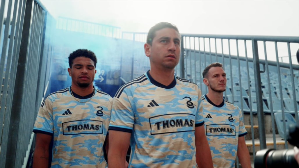
Philadelphia Union

The “For Philly” kit is pretty sweet. It reminds me of some of the warmup tops MLS has released over the years for various initiatives. It is a camouflage pattern that isn’t truly camouflage. I don’t hate it.
Overall grade: B
Portland Timbers

It probably doesn’t hurt to have adidas in your backyard as the Timbers do. But damn, every year, their kits get better and better. This one may be their best yet. I love the plaid look without it being too in your face. The black borders with the green so nicely too.
Overall grade: A
Seattle Sounders

Seattle had the Jimmy Hendrix kit, and now they have the Bruce Lee kit. I need them to do a Pearl Jam kit stat. That would be a dream of mine, but that is for another day. For this kit, I have to give them credit for going off the book and with a different color scheme from their traditional look. I can’t wait to see this one in person.
Overall grade: B+
Charlotte FC

The first batch of Charlotte kits last year were pretty decent. This is their new secondary kit and I love the purple look. I appreciate a team that didn’t go white as a secondary color and since purple is rarely used in this league, it will help Charlotte stand out more.
Overall grade: B+